
After reading an article from HESA where the author explains (referring to Times Higher Education’s annual Reputation Rankings) that “only the position of the top 6 or so is genuinely secure. Below about tenth position, everyone else is packed so closely together that changes in rank order are basically guaranteed”, we wanted to see how much movement there was at the bottom of the rankings. How did we do this?
We took 7 world university rankings that had some historical data (see note). We selected the years 2010 and 2012 and subtracted the average of the 7 rankings for the 2010 rank from the average of the 2012 rank. For example, Yale University has the overall average rank of “12” in 2010 and “14” in 2012. The equation would be 12 -14 = -2.
If you click on one of the countries, the bottom graph will only include the universities from that specific country.
A few observations:
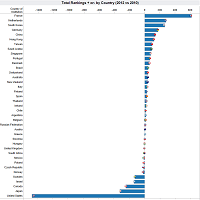
Top and Bottom countries by total + or – ranks
- European universities have generally improved their rankings
- Sweden’s quality education system is looking fragile from this angle
- North American universities, as a group, look as if they have passed their peek
- Could the massive cuts in US higher education explain the slumping in the rankings?
- Most countries, 28 out 39, remain in the + or – 100 range. The others are as follows:
| COUNTRIES | Total Difference in rank |
| France | +610 |
| Netherlands | +278 |
| Korea | +261 |
| Germany | +175 |
| China | +139 |
| Hong Kong | +123 |
| Sweden | -129 |
| Israel | -139 |
| Canada | -248 |
| Japan | -323 |
| United States | -1469 |
Top 10 University biggest increase
The biggest increases are not seen in all newer institutions. They are a mixture of new and old universities: University of Strasbourg (1538), Joseph Fourier University (1811), Wageningen University and Research Centre (1918), King Saud University (1957), Sungkyunkwan University (1393), Nanyang Technological University (1991), Radboud University Nijmegen (1923), Korea University (1905), Hong Kong Polytechnic University (1937) and Cardiff University (1883)
| Difference in rank | UNIVERSITY | COUNTRY |
| +222 | University of Strasbourg | France |
| +133 | Joseph Fourier University | France |
| +116 | Wageningen University and Research Centre | Netherlands |
| +92 | King Saud University | Saudi Arabia |
| +88 | Sungkyunkwan University | Korea |
| +73 | Nanyang Technological University | Singapore |
| +66 | Radboud University Nijmegen | Netherlands |
| +66 | Korea University | Korea |
| +63 | Hong Kong Polytechnic University | Hong Kong |
| +61 | Cardiff University | United Kingdom |
Bottom 10 Universities
50% of the bottom 10 are from the USA. 80% the 5 USA universities are publicly funded
| Difference in rank | University | Type | Country |
| -51 | Keio University | Private | Japan |
| -54 | University of Dundee | Public | United Kingdom |
| -57 | University of Cincinnati | Public | United States |
| -61 | Swedish University of Agricultural Sciences | Public | Sweden |
| -62 | Dartmouth College | Private | United States |
| -62 | Rensselaer Polytechnic Institute | Private | United States |
| -90 | Weizmann Institute of Science | Public | Israel |
| -93 | University of California, San Francisco | Public | United States |
| -106 | University of Alabama at Birmingham | Public | United States |
| -120 | Karolinska Institutet | Private | Sweden |
Note: A total of 398 universities had 5 or more rankings in 2010 and 2012.
Comments
5 responses to “Historical compilation of 7 world universities rankings: huge drop for US, rise for French”
I would be interested to see an analysis comparing the rankings and their continent of origin. I suspect that rankings from Europe will rate European universities in a much higher fashion. Is there a way I can exclude a ranking from a graph in your post?
Thanks for your feedback.
I’m working on an updated visualization that should help you compare continents.
Excluding some of the rankings is more complicated since I’ve compiled the data to give me an average. If you are looking for data on a specific university, you can just go to the university page on this site. You will see that on the left side, all the rankings data available is posted.
As promised, I updated the visualization to include continents.
As you know, you can make statistics say about anything you’d like, and your conclusion that “North American universities, as a group, look as if they have passed their peek” might be a bit of a stretch. In perusing the various rankings, it appears as though 75% of the top universities are in the United States and Canada. It’s, therefore, pretty easy to see how/why these schools don’t perform favorably on an analysis that looks at the change in ranking.
This is a very nice example of how interactive Tableau visualization can encourage exploration, development of hypotheses followed by testing and refinement. As noted in other comments some of the conclusions seem crafted for dramatic effect rather than analytical insight. There seems to be some tendency to the mean dynamic occurring between 2010 and 2012 data. It would be helpful to see if the “massive cuts in higher education spending” for the US compare with those in other countries, understand if there’s a correlation in general between spending cuts (or increases) and the change in rankings, and then speculate about causality or correlation.