Key Takeaways:
- The Network Tool Benchmarks and Identifies Potential Weak Links in Your Tech Stack: It enables institutions to compare their technology choices with peer institutions, helping them identify weak connections and potential integration challenges.
- Data-Driven IT Strategy and Decision-Making At the Forefront: By visualizing technology relationships through a color-coded network, institutions can assess system compatibility, benchmark against peers, and justify IT investments with data-backed insights.
- Optimized Integration with the “What If” Tool: Institutions can use the What If Tool to explore alternative solutions, mitigate risks, and strategically future-proof their tech stack by aligning with widely adopted industry trends.
- Try this new feature directly on our data portal, on the Network page.
Selecting the right technology for your institution can be challenging, especially when there is no straightforward way to compare your decisions with peer institutions—until now. Our new Network Tool offers unparalleled insights into your tech stack, enabling you to benchmark your systems against similar institutions and identify potential weaknesses.
Table of Content
- What Does It Do?
- How Is the Link Color Calculated?
- Visual Explanation of the Network Tool
- How Can Institutions Use this Tool?
- Example: A Homegrown Portal with Weak Links
- What If You Find a Weak Link?
- Why is This Network Tool Game-Changing?
🔍 What Does It Do?
By analyzing data from thousands of peer institutions, the Network Tool maps relationships between technology systems. Each system is represented as a node, with links illustrating how frequently two systems are used together.
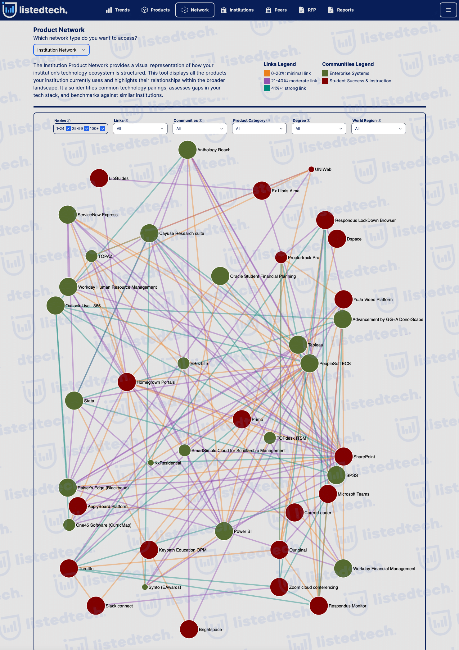
How Is the Link Color Calculated?
The strength of each link is visually represented by its color, calculated using the following formula:
Note: We include secondary systems in the number of active implementations to give you a full picture of related technology.
Color Legend:
- 📊 Orange (≤ 20%) – Weak connection: These systems are rarely used together.
- 📊 Purple (21%-40%) – Moderate connection: The systems are occasionally used together.
- 📊 Teal (41%+) – Strong connection: These systems are frequently implemented together.
This methodology ensures that the tool highlights real adoption trends rather than arbitrary pairings.
Visual Explanation of the Network Tool
The Network Tool compiles data from multiple sources, which can initially seem complex. Below, we illustrate its functionality with a simplified example.
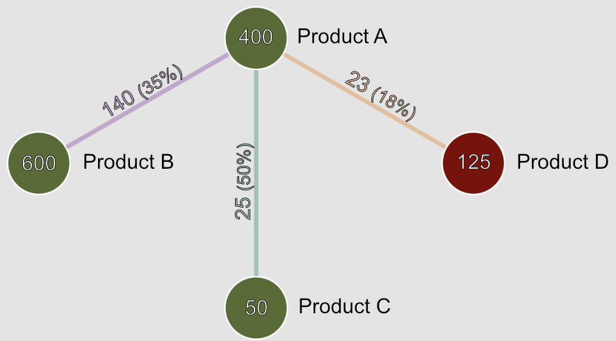
Consider Product A, which has 400 active implementations (including primary and secondary systems). At a particular institution, Product A is implemented alongside Product B, Product C, and Product D.
Focusing on the relationship between Product A and Product B:
- Product B has been implemented 600 times worldwide.
- Product A and Product B are used together in 140 institutions.
- Using the aforementioned formula:
This classifies the relationship as moderate (purple color).
How Can Institutions Use This Tool?
Beyond identifying weak links, this tool empowers institutions to make data-driven improvements in several key areas:
- Optimize System Compatibility
- Assess whether your systems are commonly used together or if you’re in uncharted territory.
- Reduce costly integration challenges by choosing tech solutions with proven compatibility.
- Benchmark Against Peer Institutions
- Compare your tech stack with similar institutions.
- Avoid over-reliance on homegrown or niche solutions that may lack long-term support.
- Evaluate Future IT Investments
- Considering a new system? Check if it aligns with your existing stack using the Network Tool.
- Identify alternative solutions that work well with your current technology using our “What If” tool.
- Strengthen Strategic IT Planning
- CIOs and IT leaders can use these insights to future-proof their tech strategy.
- Ensure your stack aligns with industry trends, reducing long-term risk.
- Justify IT Decisions with Data
- Need buy-in from leadership? Use peer-backed data to support funding requests.
- Show decision-makers why certain systems are better choices.
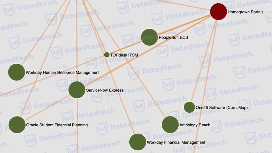
Example: A Homegrown Portal with Weak Links
Let’s take a real-world example from the tool.
An institution has a homegrown portal as part of its student success and instruction tech stack. The Network Tool reveals several orange links between this portal and major systems such as:
🔴 PeopleSoft ECS
🔴 ServiceNow Express
🔴 Oracle Student Financial Planning
These orange links indicate that very few institutions use these systems together with a homegrown portal.
What does this mean?
- These weak links suggest potential integration challenges.
- The institution may be missing out on widely adopted alternatives that better integrate with these systems.
- If the institution is satisfied with its setup, the tool still provides data-driven insights to ensure alignment with broader trends.
What If You Find a Weak Link?
The What If Tool, available on the Peer Page, allows institutions to explore alternative solutions by analyzing:
- Common system pairings among peer institutions.
- Alternative technologies that may improve performance.
- Potential risks associated with the current setup.
For instance, an institution using a homegrown portal can use the tool to:
- Determine whether switching to a widely adopted portal could improve efficiency and reduce costs.
- Identify off-the-shelf student portals adopted by peer institutions.
- Assess integration feasibility with existing PeopleSoft, ServiceNow, or Oracle systems.
Why is This Network Tool Game-Changing?
✅ No other tool offers this level of peer-driven technology insight.
✅ Save time and reduce risk by making informed IT decisions.
✅ Stay competitive by aligning with industry trends.
💡 Ready to explore your institution’s tech stack like never before? Institution users can start using it right now. Want more details before committing? Book a meeting with us today!