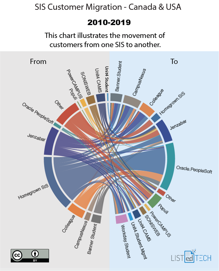
This week, we will look at how the SIS market evolved in the past decade, and in particular, which product was selected to replace a previous one. To better show the transition between products, we created a chord diagram.
General note
The graph only displays about 30% of the implementations for the said timeframe. Why did we not include all implementations? Some smaller institutions which did not have an SIS (about 20-25%) installed an SIS for the first time. Another portion of the “non represented” are institutions that were created during this decade (about 5%). Also, some institutions simply chose to upgrade their current product (about 10%). Finally, sometimes, we have yet to find the data (Canadian sorry!).

PDF Version of the Graph
Diagram analysis
In the last ten years, many institutions have moved from their homegrown systems to a commercial solution.
The big move from homegrown systems mostly benefited Oracle Peoplesoft.
In general, no big exodus of one system to another.
Jenzabar lost clients to almost every competitor but also won clients from every competitor.
When we look at the “Other” category, we can notice that with the gradual disappearance of homegrown systems, the SIS market in HigherEd is more and more about fewer but bigger commercial solutions.
Workday is not present on the left side of the diagram since Workday Student was only launched in 2016.
Data Notes
We only show implementations being conducted from 2010 to 2019.
This analysis does not represent market share since we don’t have all the systems that have been replaced.
The dataset only covers the United States and Canada.
As mentioned earlier, we do not include upgrades or rebranding in the diagram. In other words, we do not represent Product A.0 to Product A.1.
In the case of product rebranding, we present the most recent name in the diagram.
To create the graph, we count the number of institutions (active implementations).


