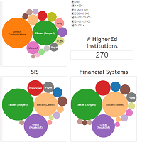

As promised in my first Canheit tribute post, I have created a second vizualisation based on technology used by Canadian higher education institutions (colleges and universities). The following viz has 5 main graphs, each representing a different category. The size of each bubble represents the percentage for each system used compared the other systems in that category. The 5 categories are:
- Learning Management Systems (LMS)
- Portals Systems
- E-mail systems
- Student Information Systems (SIS)
- Financial Systems
If you select the size of the institutions (top right), all 5 visualisations will change simultaneously to reflect this market segment. Play with it and see how the size of an institution can affect its decisions in terms of systems.


