
This is a follow-up to last week’s “Student Information System Software by Total Enrollment” post. We got a massive amount of positive feedback… Thanks!
In all of the conversations, we got questions that we promised to answer. Well, this is the post that will hopefully answer all those questions.
What country did last week’s data include?
The data was from multiple countries, but the bulk was from North America. For my fellow Canadians, I reproduced the graph using only Canadian data. However, I had to remove a few products because of low institution counts.
Interested in HigherEd Technology? Sign up to receive our free weekly newsletter! We hand pick the most relevant, interesting and important stories affecting HigherEd IT professionals in product selections, implementations as well as system retirement.
“What would be interesting is to see and compare the % of institutions that fall into the size of 2k -10k. I assume it all aligns and we find that the size of the institution has been a magnet for the type/brand chosen.”
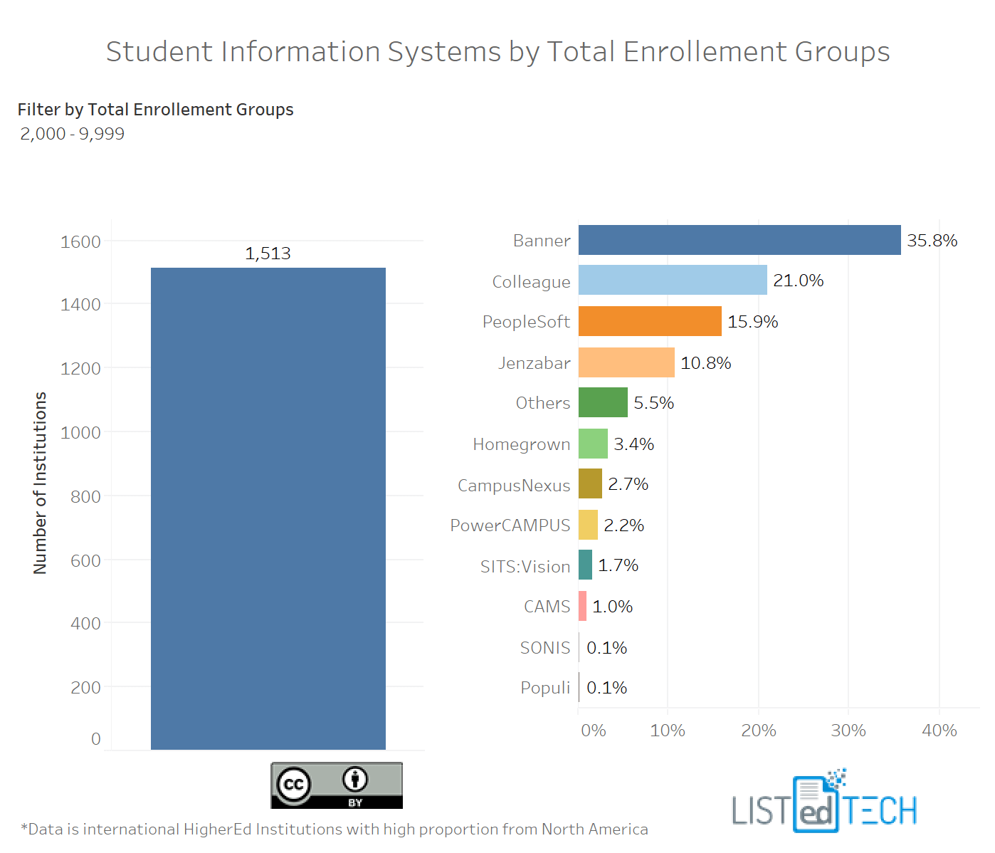
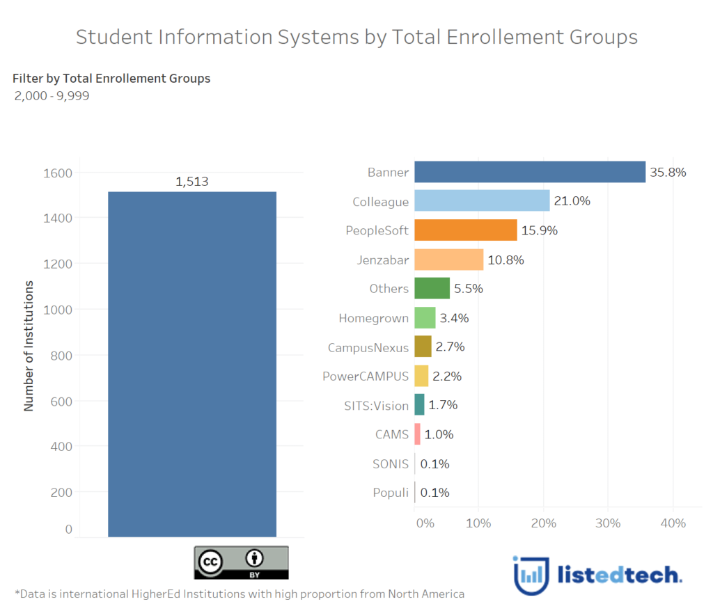
As you can see in the visualization below, you can move the top slider to get different group sizes: 1-1,999, 2,000-9,999, 10,000-19,999 and 20,000 +. By selecting a different group, the percentages change and show that the size of the institution does reflect the product choice.
Notice how Peoplesoft and Janzabar exchange spots as you move from small institutions to large ones.


