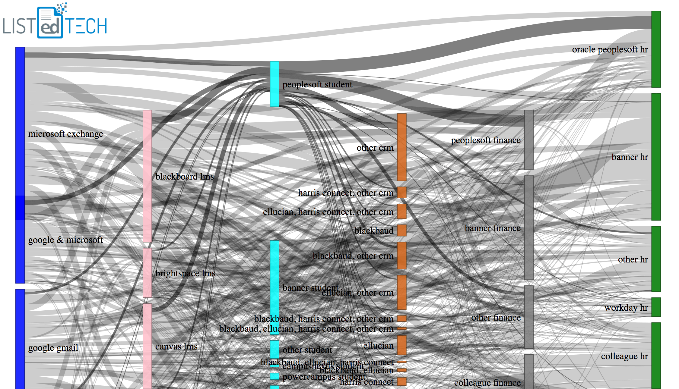
The graph below is… chaotic to say the least! What I was hoping for, initially, was to illustrate how systems are linked to each other. I started with six major product categories: emails, LMS, SIS, CRM, Financial, and HR. I wanted to see how products in these categories were linked to other products -i.e. if an institution has Google Mail, does it most likely chooses blackboard as an LMS and so on.
So the graph doesn’t clearly indicate these links, but there are a few interesting observations that I was able to expand on:
On the far right column, if you select the Workday HR grouping, you can see that its lines equally go to all other major systems.
The big ERP companies (Ellucian, Oracle, Jenzabar, etc) have major links leading to their products.
Smaller institutions that typically use ERP systems like Jenzabar, Colleague or CAMS have thicker lines going to LMS products like Moodle who is also used by smaller institutions.
By looking at the graph, I instantly got sidetracked by the CRM column (4th in orange). Even if I tried to limit the number of system for each column and only show a few by category, the CRM column showed how institutions use several CRMs at the same time. This is showed by groupings in the CRM column that have multiple company names. A simple example of this can be found in the first column (email), in blue. Look for the grouping, “google & microsoft”; it shows that the institutions which use both systems (Google and Microsoft) often using Gmail for students and Microsoft Exchange for staff.
Note that by moving the products in a column, the links are more clearly highlighted.
We, at ListEdTech, use CRM as a general term that encompasses several groups of systems that can be used in every step of a students journey: everything from recruiting, admissions, enrollment, general communications, and of course endowments.
<a href=’#’><img alt=’Box-and-Whisker Canada ‘ src=’https://public.tableau.com/static/images/SI/SIS-Canada/Box-and-WhiskerCanada/1_rss.png’ style=’border: none’ /></a>
Interested in HigherEd Technology? Sign up to receive our free weekly newsletter! We hand pick the most relevant, interesting and important stories affecting HigherEd IT professionals in product selections, implementations as well as system retirement.
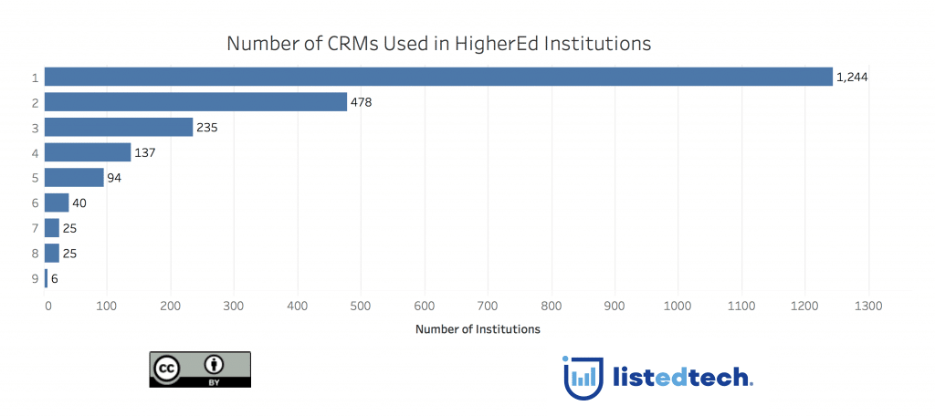
If we look at the systems that we have in our database (2,300 institutions), we can see that each institution has on average two CRMs. But as you can see in the graph, some institutions use up to nine specialized CRMs.
An interesting (if not logical) correlation is that over 50% all HigherEd institutions have a CRM that’s from the same company as its SIS.
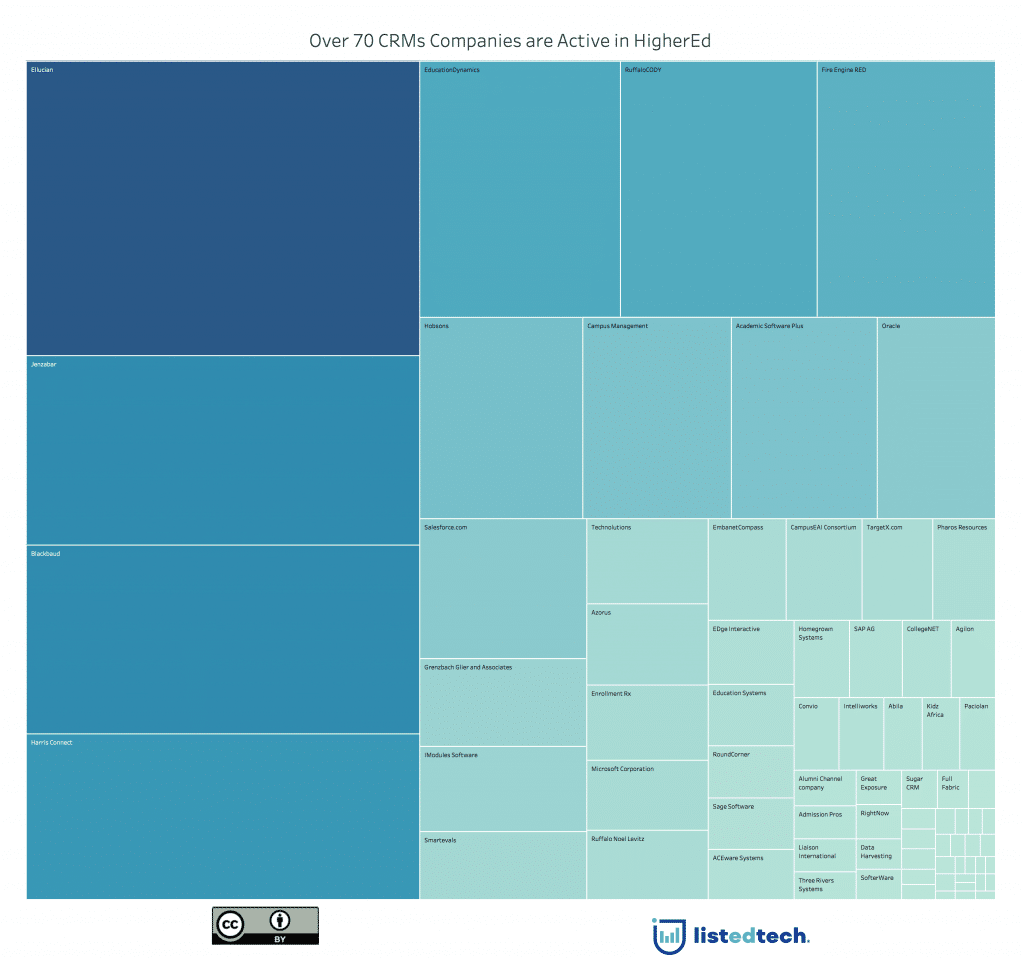
The graph below shows the over 70 companies in the HigherEd market and their relative market share:
Notes on the data:
For the first graph (Sankey chart), we used 1,400 HigherEd institutions that had all six product categories (email, learning management systems, student information systems, customer relationship systems, financial systems and human resource systems). However, this does not necessarily represent the market shares.
For the other two graphs, we looked at all the data in our database, about 2,300 institutions and almost 5,000 listed CRMs.
