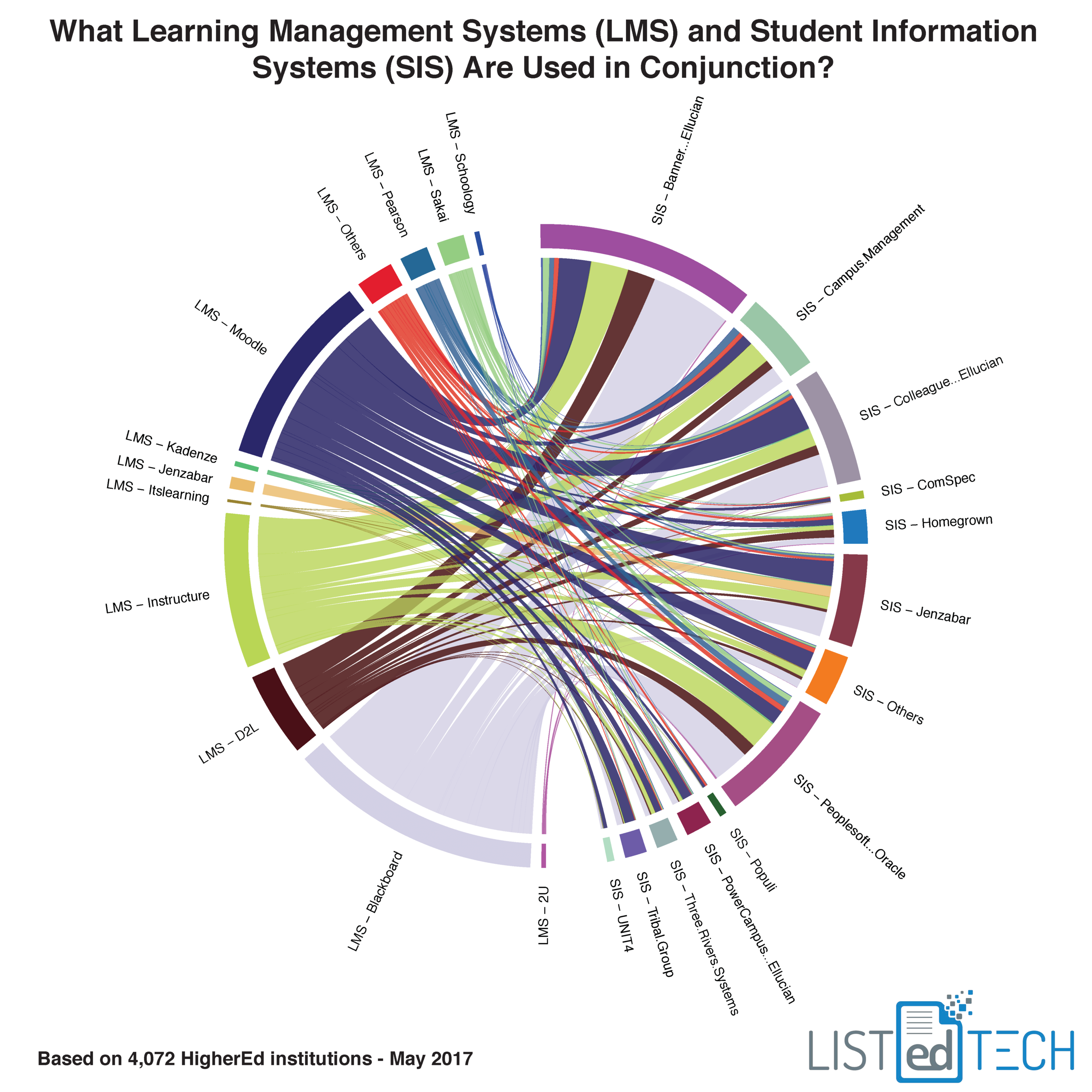
We use this chord diagram to show the movement in the LMS market – from the old system to the new system. We got great feedback, so we decided to use the same format to represent the relationship between the LMS market and the SIS market. As most of you know, several LMS are out there. We show the top 11 that represents about 95% of the market.
The SIS market is even more crowded. We show the top 12 used by HigherEd institutions.
Each line represents one HigherEd institution. It links the learning management system and its student information system. The data is based on 4,072 institutions for which we have both the active SIS and LMS in our database.
**Updated Note**
The proportions of LMS and SIS are not necessarily representative of market share. We simply took a subset of institutions that had both a SIS and a LMS system listed in our database.
Interested in HigherEd Technology? Sign up to receive our free weekly newsletter! We hand pick the most relevant, interesting and important stories affecting HigherEd IT professionals in product selections, implementations as well as system retirement.
For a high-quality PDF version that will help you see every line, see the following link.


