I’m always amazed by the amount of institutions that the United States has in the top 100, 200, 300 or 400 of World university rankings. It always has more than any other country. This amount has been decreasing in the last few years but it’s still four times as many as its closest competition. The Ivy League schools are always at the top of the rankings and they dominate the top 10 for all rankings. This is easily confirmed by doing a small Google search.
US dominates global university reputation rankings (Media FHE)
US dominates Shanghai Jiao Tong world rankings (Times Higher Education)
US dominates Chinese world university rankings (China Post)
I was discussing this with our Registrar at the University of Ottawa and he showed me a table that one of our Associate Vice-President had made to look at this data in a different way. The table showed that the number of US institutions is not super impressive when you look at the total number of institutions the country has compared to other countries.
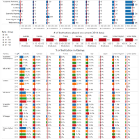
I kept that in mind and created the visualization you have below. Before looking at the viz, let me explain the sections:
The top section has the number (2011-2014) of institutions (per country) for each of the 8 World rankings.
The middle section has the number of institutions (2014 data) by country
The bottom section is the ratio of institutions of #1 over #2.
By default, the visualization is set to look at the institutions in the top 400 of each World ranking. You can also select the top 200 and 100.


